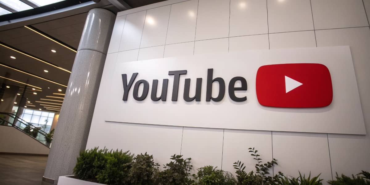
YouTube has officially explained its subtle logo refresh, which has been gradually rolling out over the past few months. The most noticeable change is a slightly cooler, pinker red for its iconic logo, sparking curiosity and attention from users.
In an interview with Google Design, YouTube’s design team outlined the rationale behind the update. Robyn Lee, the visual design lead, explained that the redesign started by identifying outdated elements, with color being a priority.
They aimed for an evolution, not a drastic change. Lee shared, “We knew that evolving our palette would make an immediate and significant impact… but we wanted a delicate touch.”
One of the main goals of the redesign was to address technical issues with the previous pure red, which caused screen burn-in, color distortion, and visibility issues on various devices.
The updated cooler red resolves these challenges while giving the logo a more vibrant and approachable feel. Jessie Zo, senior visual designer, emphasized that they avoided colors that felt “domineering, cold, or corporate.”
Additionally, a dynamic red-to-magenta gradient has been introduced, most notably seen in the playback bar. Lee further explained, “Magenta doesn’t often appear in the natural world, so it symbolizes the imagination and evolution that YouTube embodies.” The gradient is angled at 45 degrees, signifying forward movement.
While many users have noticed the changes, not everyone is a fan of the cooler red hue. Despite mixed reactions, the redesign shows YouTube’s commitment to evolving its brand while maintaining its legacy.


Leave a comment