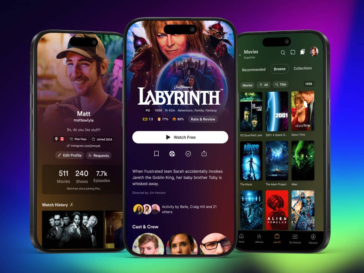
Plex has introduced a new interface that modernizes its design but raises questions among long-time users.
The update brings a sleeker homepage with higher information density, larger media posters, and streamlined navigation.
It eliminates the older tab-and-menu system in favor of one-handed use, but switching between libraries still requires multiple taps.
The redesign also reflects Plex’s focus on ad-supported streaming and content discovery. Dedicated tabs for Live TV and On-Demand replace collections and playlists, consolidating them into the library feed.
A new Discover tab allows users to track shows and link to external streaming platforms, much like JustWatch.
While the refreshed design appeals to casual users, it has sidelined features important to Plex’s self-hosted roots, such as codec details and customizable navigation.
This shift suggests Plex is prioritizing its streaming ambitions over local media playback, leaving long-time users concerned about its direction.
The app is still in development, so some features may improve. However, for users who rely on Plex for personal media libraries, alternatives like Jellyfin might be worth exploring.


