Microsoft is rolling out a redesigned Start menu in Windows 11, offering a wider layout and allowing users to disable the recommended feed of files and apps. However, before settling on this design, Microsoft tested several concept designs, some of which could have radically changed how the Start menu functions.
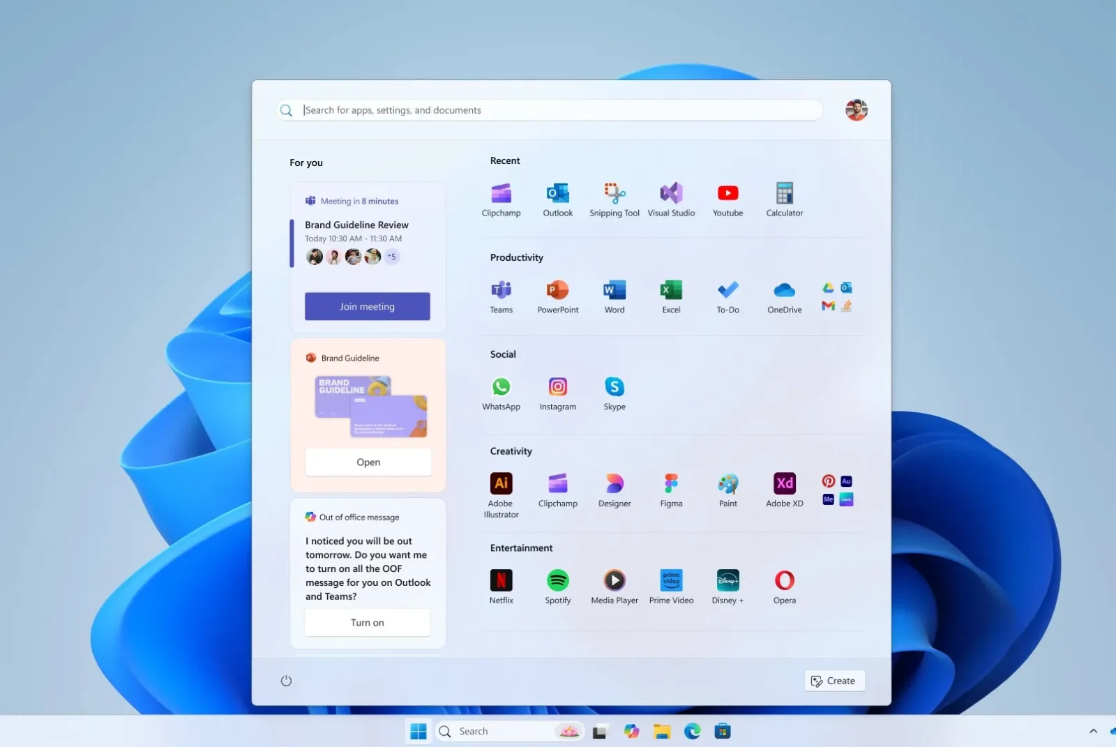
In a blog post detailing the redesign process, Microsoft shared five concept designs that were considered but ultimately rejected. These designs varied from more rounded menus with widget-like functionality to designs that took up entire vertical screen space. One of the concepts featured a “For You” section that included personalized content like Teams meetings, YouTube videos, and recently used files.
Another concept placed the For You section to the side, focusing the main Start menu on categories of apps. Another version imagined the Start menu as a landing page, offering shortcuts, files, and direct access to features like Android phone integration and creation tools. Some prototypes even explored a scrollable, vertical Start menu to provide an entirely new user experience.
The Windows design team emphasized how much experimentation was involved in the process, with sketches, Figma frames, and paper prototypes all helping to shape the final result. The designs were tested with over 300 Windows 11 fans, using eye-tracking heat maps and feedback from co-creation calls to refine the concepts.
The aim of the redesign is to make the Start menu more customizable, faster, and more accessible while ensuring it still aligns with the muscle memory users have developed over the last three decades. The result is a Start menu that’s larger and more customizable, with options to remove the recommended feed and the addition of a phone companion panel for quick access to calls, messages, and phone files.
This new design is currently being tested with Windows Insiders and will be rolled out to all Windows 11 users in the coming months.





Leave a comment