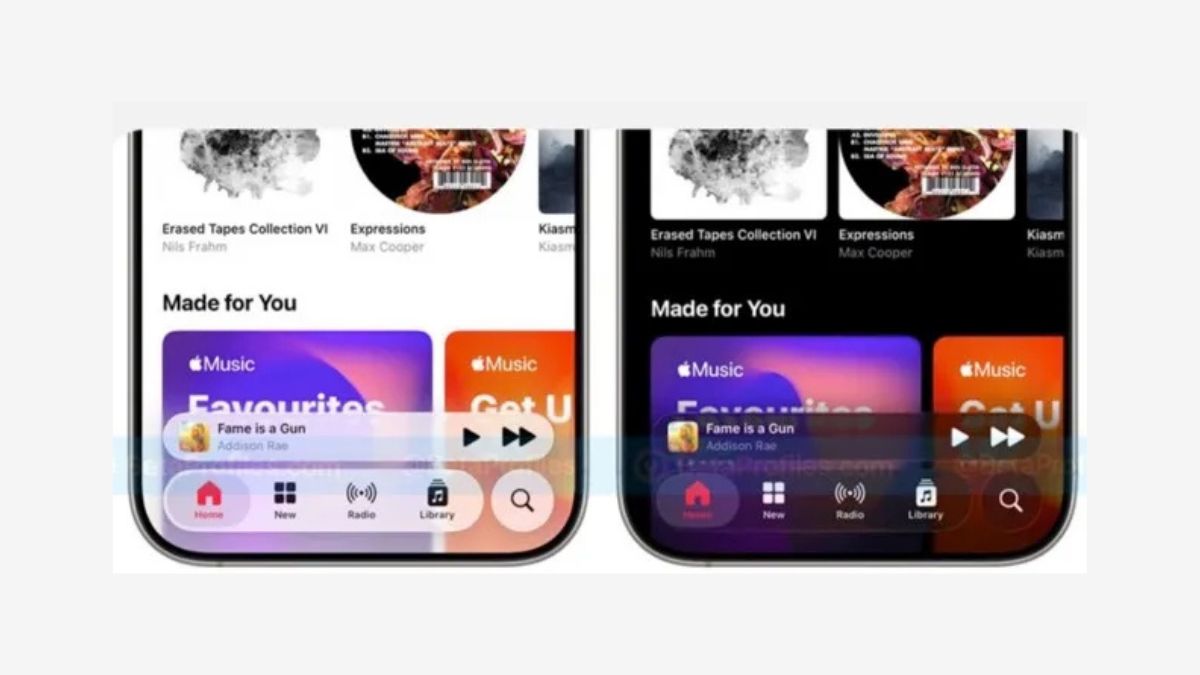
Apple has released the third developer beta of iOS 26, bringing further changes to its new Liquid Glass design. However, many users and experts are unhappy with the latest adjustments, as the interface now features much less transparency and looks more like frosted glass than the original clear, glass-like effect.
Since the first iOS 26 beta, Apple’s Liquid Glass design introduced highly transparent UI elements across buttons, menus, and notifications. While visually striking, early testers noted the effect made some menus harder to read, especially the Control Center and notification panels. This raised concerns for users with eyesight difficulties.
In response, Apple slightly reduced transparency in iOS 26 beta 2, improving legibility by increasing background blur and contrast. Despite this, the new beta 3 takes the change even further by significantly lowering transparency, which some users feel has dulled the intended “liquid” effect.
Prominent Apple commentator Mark Gurman criticized the shift on social media, saying Apple “threw much of it away” and joking that the design should now be called “Frosted Glass.” Many users echo this view, calling the change a step back from the bold original vision.
Some suggest Apple should add options for users to customize transparency levels based on preferences or screen context. However, there is no indication Apple will offer this kind of control in the final release.
The iOS 26 public beta is expected soon, with the official launch anticipated in September. Apple may continue tweaking the Liquid Glass interface in upcoming betas before the final version.


