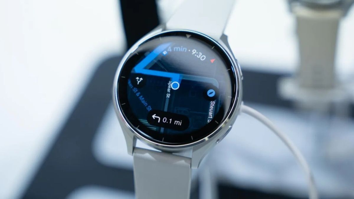
Google is testing a major redesign of its Maps app for Wear OS watches. This new look, called Material 3 Expressive, brings bigger buttons, brighter colors, and smoother animations to smartwatch screens. The update is arriving ahead of the upcoming Wear OS 6 release.
In this new design, Google has replaced the old three-circle layout with two rows of large, pill-shaped buttons. The biggest button opens the map view. Next to it is a search button that starts voice input by default. Shortcuts for “Home” and “Work” are now smaller pills, saving more space on the screen.
The app also shows a list of recent places, with a new “Show more” button to reveal up to eight recent locations. Below that, users see a grid of cards for popular searches like Restaurants, Groceries, Coffee, and ATMs. Other features include options for Offline maps, Settings, and account switching.
The new “Search & go” Tile now fits more shortcuts into a compact space, giving quick access to recent searches, Home, Work, and Nearby Places.
Google’s Material 3 Expressive style uses a teal accent color, matching its mobile app. It also adds larger touch targets, making it easier to use on small smartwatch screens like those on the Galaxy Watch 4. Google says the design focuses on personalization and smoother animations, though syncing watch colors with phone themes isn’t available yet.
Along with the new look, the upcoming Wear OS 6 promises better performance, including up to 10% improved battery life.
This redesign makes Google Maps on Wear OS more colorful, easier to use, and better suited for smartwatches. The full rollout is expected soon with the release of Wear OS 6.


