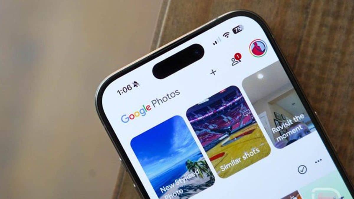
Google Photos has recently rolled out a redesign to its web interface, replacing the Library section with “Collections.”
This update aligns with changes previously introduced to the mobile versions of Google Photos (Android and iOS) earlier this year.
The side panel has removed “Explore,” and “Sharing” has been replaced with “Updates.” The Updates feed displays shared albums, conversations, partner sharing, memories, and storage information, and it has the same design as the mobile interface when it was introduced in early November.
Meanwhile, the Library section is now “Collections,” and it features a more organized layout with quick access to key sections like People & Pets, Places, Videos, and Recently Added.
This new layout roughly corresponds to the grid view previously introduced to Google Photos on mobile devices.
One significant change is the positioning of dropdown menus. Albums and Documents are now elevated, while Favorites is no longer listed first.
The redesign also provides users with easier access to sections like Archive, Locked Folder, and Trash directly from the side menu.
Overall, this new interface offers a more streamlined and accessible experience on desktop, allowing users to quickly find and manage their photos and videos.
It provides more direct access to various sections and better organization, making the platform more user-friendly.


