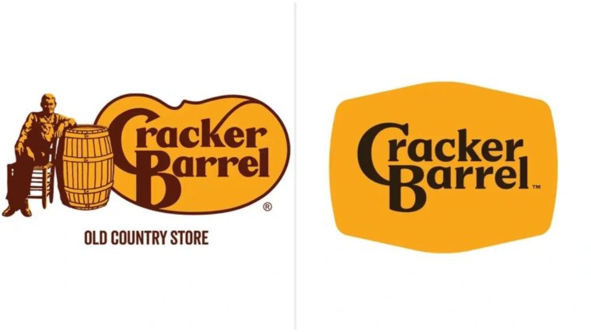
Cracker Barrel has unveiled a new logo as part of a wider rebranding effort, but the change has sparked a strong backlash from customers and investors alike.
The Southern-style restaurant chain has removed its long-standing image of a man sitting beside a wooden barrel. The new design keeps the brand’s gold and brown colour scheme but opts for a simpler, more minimalist text-based logo.
Chief Executive Julie Felss Masino said the redesign was intended to modernise the company’s image and attract new customers, while keeping the spirit of Cracker Barrel intact. The update comes alongside ongoing restaurant renovations aimed at creating a brighter and more contemporary atmosphere.
However, the response from loyal fans has been overwhelmingly negative. Many social media users described the new look as “cold,” “sterile,” and “generic,” arguing it strips away the nostalgia that made the brand popular. Political commentators, including Donald Trump Jr., also criticised the move, suggesting it was tied to diversity and inclusion initiatives.
The criticism extended beyond public opinion. Cracker Barrel’s shares fell by more than 12% following the announcement, marking their steepest decline in months.
Despite the uproar, company leaders remain confident, maintaining that the changes reflect what today’s guests want. The controversy highlights the challenge businesses face when attempting to modernise without losing the tradition that defines them.


