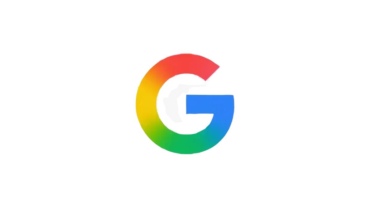
Google is adopting a new gradient ‘G’ icon as its official logo across all products and services.
The design, first introduced in May for Google Search, blends the company’s four signature colors into a gradient. It replaces the old partitioned ‘G’ that had been in use for a decade.
Google said the new look reflects the company’s growth in the AI era. The brighter colors and gradient effect are meant to symbolize innovation and creativity while keeping the familiar red, blue, green, and yellow palette.
The icon already appears on Google Search apps and web favicons. It will now expand to more platforms, including the Google Help support site, where the new design is already live.
Google also noted that the same gradient style was applied earlier this year to the “Gemini spark” branding, marking a wider shift in the company’s visual identity.
The rollout will continue over the coming months as the updated icon becomes a universal symbol of Google.


