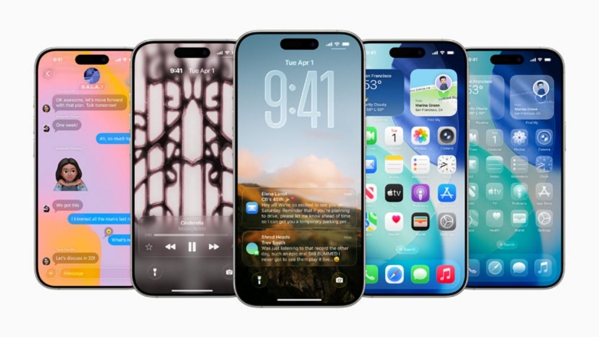
Apple’s new “Liquid Glass” design for iOS 26 has sparked a storm of criticism online. Announced at WWDC 2025, the design was meant to be Apple’s biggest visual update since iOS 7. Instead, it quickly became a meme, with users comparing it to Microsoft’s old Windows Vista look.
On platforms like X (formerly Twitter) and Reddit, users are mocking the new translucent interface. The trending phrase? “Welcome back, Windows Vista.” Many users feel Apple’s update is not bold or fresh — just recycled design from the 2000s.
One user posted, “Apple just reinvented Windows Vista. Revolutionary.” Another joked, “My iPhone is now a time machine.”
But beyond the jokes, serious complaints are rising. People with poor eyesight or those using their phones in bright places say the design could be hard to read. The heavy transparency makes text blur into backgrounds. Users are asking Apple to make the effect adjustable for better accessibility.
A popular comment summed it up: “Cool look, but this is going to be an accessibility nightmare.”
Even developers testing the iOS 26 beta are frustrated. Many say notifications are hard to read and that “form over function” is winning again at Apple. Some wonder why Apple embraced the same glassmorphism style that designers have criticized for years.
Another common complaint is that Apple focused too much on looks and didn’t show enough new features. “I expected more from Apple Intelligence,” one user said.
Some even mentioned Apple’s late co-founder. “Steve Jobs would have fired everyone,” one post read, reflecting the belief that Jobs would not have approved this shift away from clear, user-friendly design.
As iOS 26’s full release gets closer, the question is whether Apple will listen to feedback or stick with the shimmering, glassy look. For now, the internet is not impressed.


