Netflix has introduced a big change to its service interface. The company says these updates will make the platform easier and more fun to use. But many subscribers disagree and have shared complaints online.
Netflix’s Chief Product Officer Eunice Kim and Chief Technology Officer Elizabeth Stone announced the new design last month. The changes include a new TV interface, a mobile app with a TikTok-style vertical scroll, and an AI-powered search feature for better results.
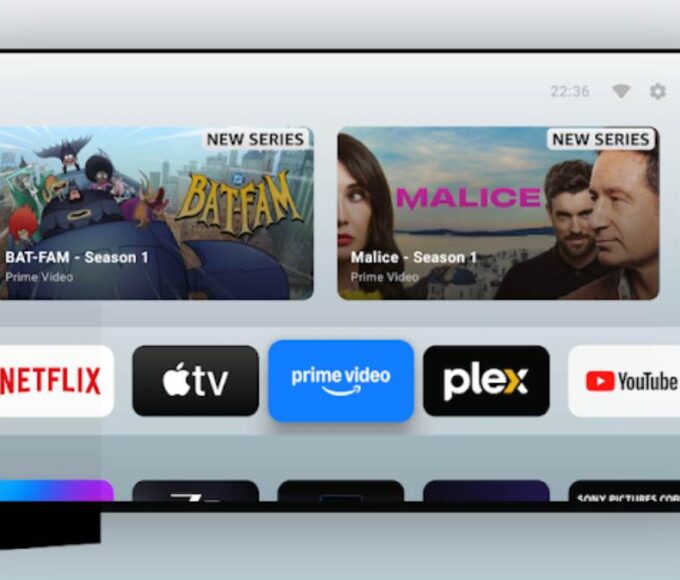
Netflix says the new design is cleaner and more modern. It shows fewer movie and show posters at once, replacing the old row of seven posters with just three or four. It also includes auto-playing preview clips.
However, many users do not like the new look. They say it limits what they can see when they open Netflix. Some popular sections like “New & Popular” and “Categories” have been removed. Users say the “My Netflix” and “Home” tabs now look almost the same, making navigation confusing.
On social media, some subscribers wrote they find the new interface frustrating and hard to use. Some even said they will cancel their Netflix subscription because of the changes.
Netflix has over 300 million paid subscribers worldwide. The company says some users do like the new design and they are working to improve it before a full global release.
It is not clear how many people dislike the changes or if they represent a small but loud group. Netflix has not shared detailed feedback data.
If you have tried the new Netflix design, share your thoughts. Are you happy with the changes or do you prefer the old look?


