The Google app on iOS just got a visual refresh, and it might be hinting at bigger branding changes ahead.
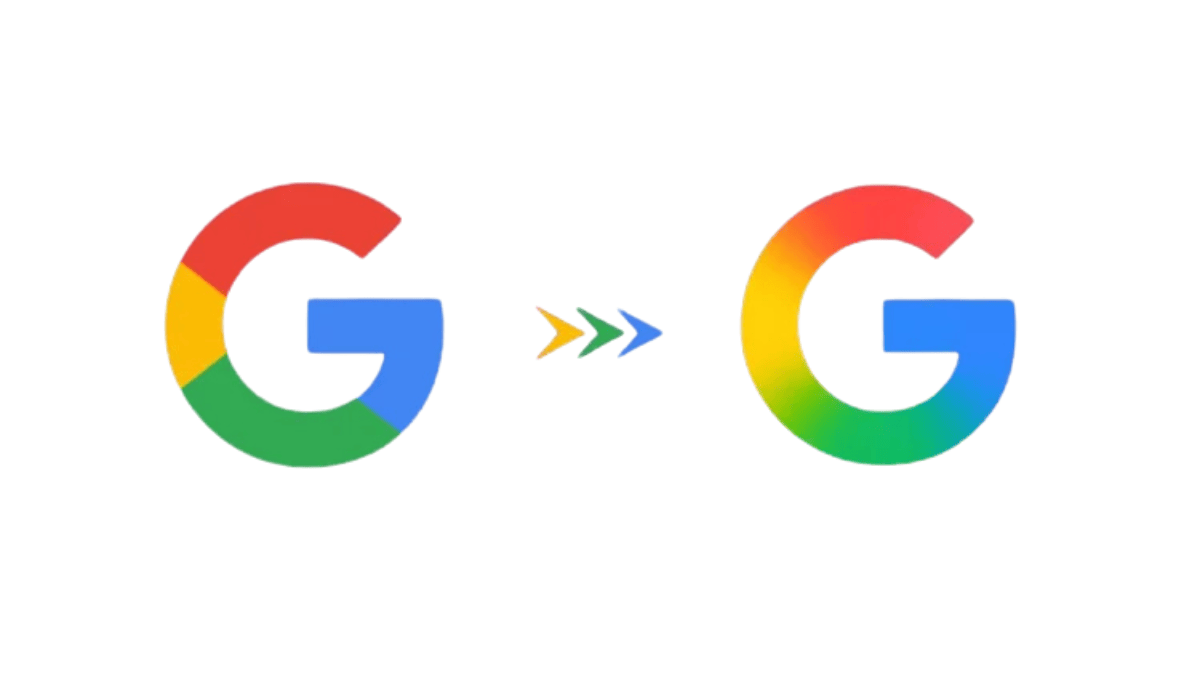
A newly updated app icon spotted by users shows off a redesigned version of Google’s iconic “G” logo — this time with soft color gradients instead of the usual solid red, blue, yellow, and green segments.
The new gradient G blends the classic colors together and tweaks them slightly — brighter reds, greens, and yellows, plus a deeper blue.
The design choice closely aligns with Google’s growing AI identity, especially the branding of Gemini, which already leans heavily on gradients in its icon and UI design.
This visual shift likely isn’t random. The gradient style is becoming a common signal for AI-related features across Google’s ecosystem.
By updating the app icon with this look, Google may be nudging users to associate the Google app more closely with its AI-powered capabilities.
Given Google’s history of rolling out design changes gradually, it’s likely just a matter of time before this updated icon — and perhaps a broader rebranding — appears on Android and elsewhere.


Leave a comment