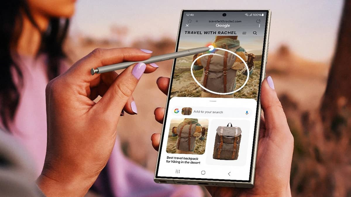
Google is redesigning its Circle to Search feature, adding a new app drawer in place of the translate button.
This change comes after the removal of the Lens button from the Circle to Search bar. The new interface, found in the latest Google app beta, is chunkier with UI elements encased in a rounded box.
The app drawer allows access to more features, including Google Lens and translation, but requires an extra tap.
The music search button will remain next to the search bar, though users hope for more customization options, such as swapping it for Lens or translation.
This update lays the groundwork for further expansion of Circle to Search’s capabilities, including a potential feature allowing Circle to Search in videos.


