Plex will launch new mobile and TV apps in early 2025. The streaming service is starting over with a fresh design and better features.
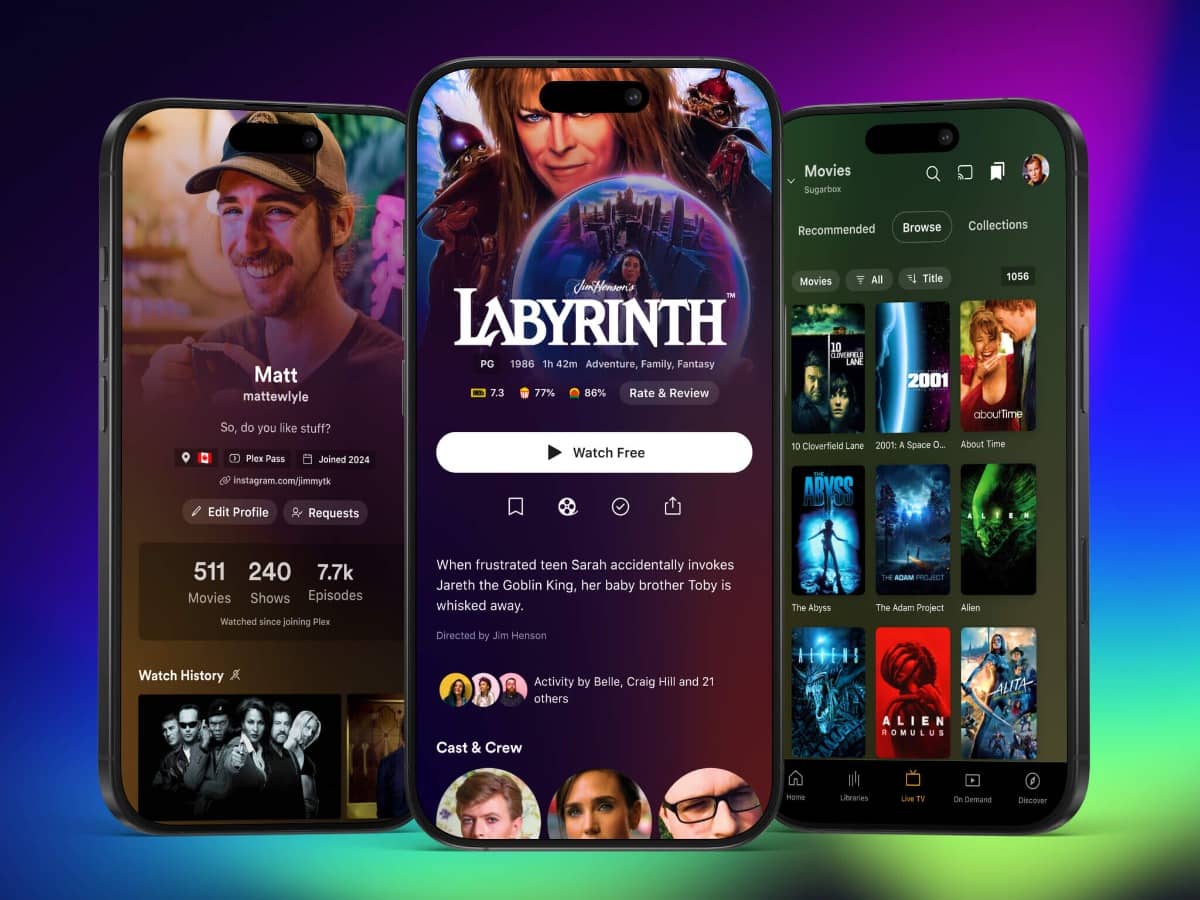
Users can test the new mobile app now. It shows bigger artwork and matches the look of other Plex apps like Dash and Photos. The new design makes user profiles work better and fixes features that felt out of place in the old app.
Plex is making a big change in how it builds apps. Instead of separate code for phones and TVs, all apps will share the same code. This means new features will come to all devices at the same time.
The new design fixes old problems. The hard-to-find “Library” tab is now called “Browse” and sits at the top of the screen. A new bottom menu clearly shows personal content, Live TV, and free shows. Users can now browse Live TV channels while watching their current show.
Testing starts now, but some features like playlists are missing. Plex will add more features weekly. iPhone users should note that only some can join the test due to App Store rules. Users can keep their old app while testing the new one.
The complete TV and mobile apps will launch in early 2025.


